DOWNTON ABBEY: A New Era (2022)
Graphics Assistant
Extending a familiar world through historically grounded design
The Project
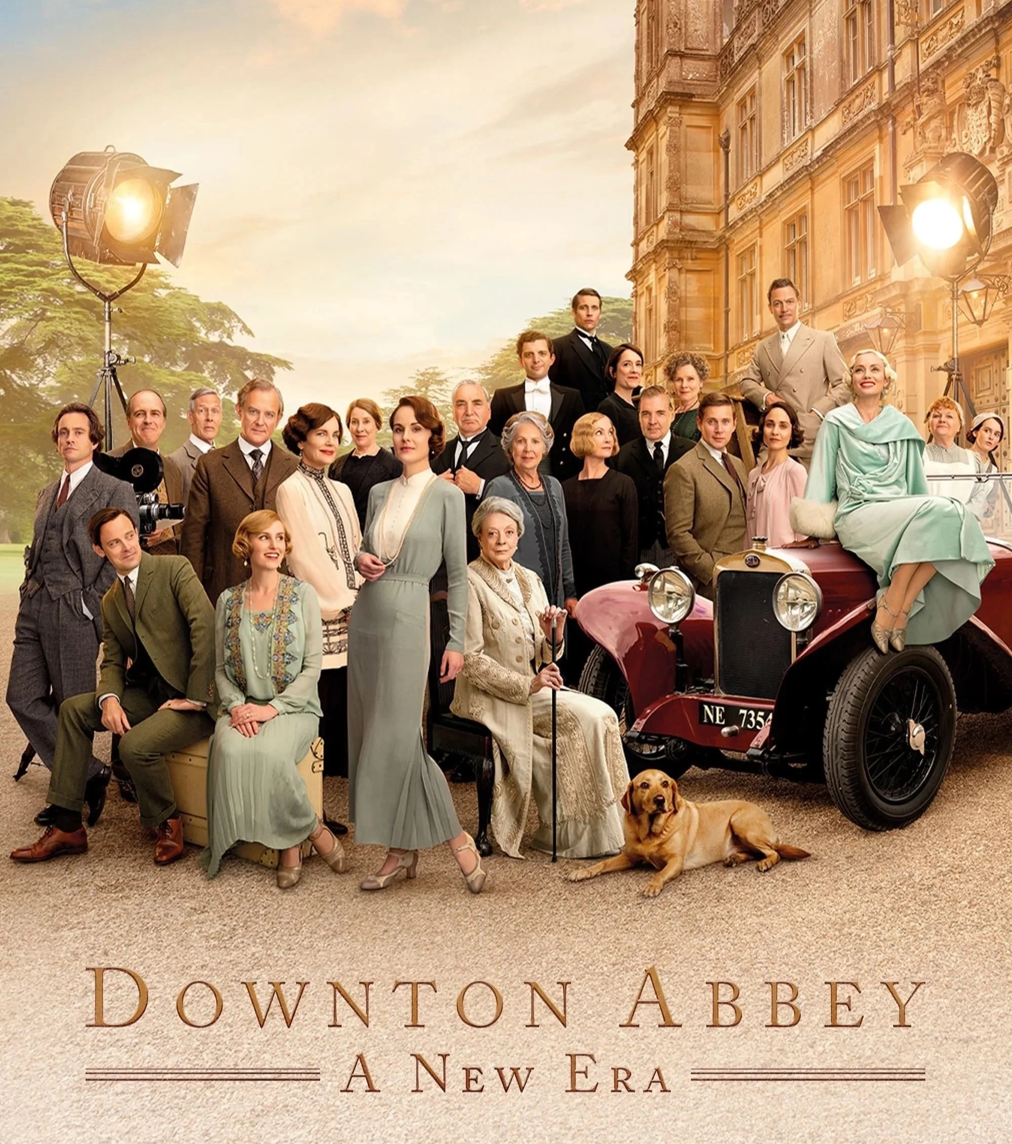
Downton Abbey: A New Era is set in 1928, at a moment of social and technological change. Alongside the continuation of family storylines, the film centres on two major developments: the arrival of a silent film production at Downton and the changing understanding of modern medicine.
I worked as a Graphic Designer on the film, producing historically accurate graphics that adhered closely to the established visual language of the franchise while supporting these narrative shifts.
IMDb Page
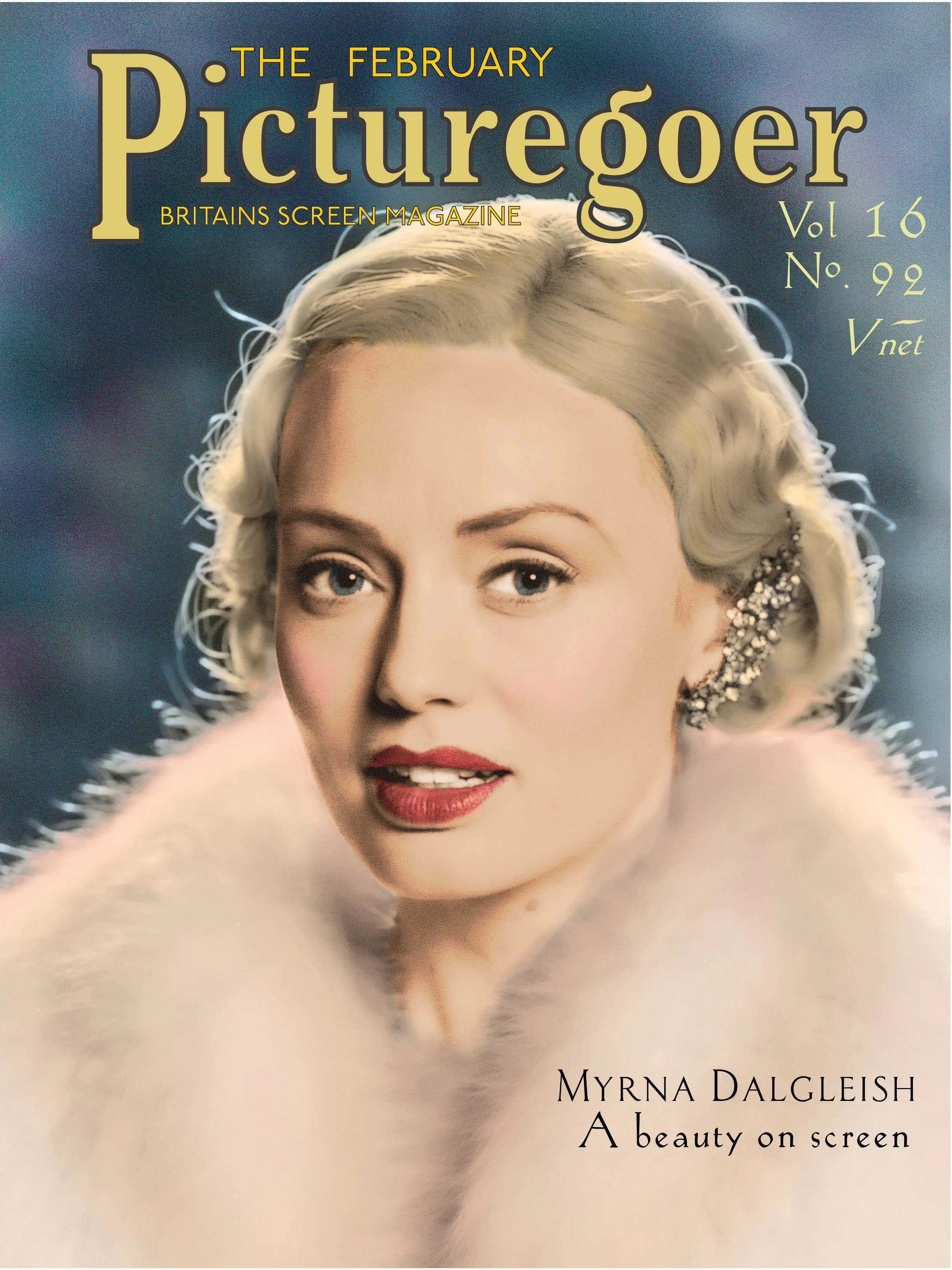
Magazine cover featuring a hand coloured photograph.
The magazine cover was inspired by Picturegoer, a widely circulated British film magazine that emerged in the early 1920s and became a key part of cinema-going culture. Sold in cinemas and featuring many of the era’s most recognisable stars, Picturegoer helped shape how film actors were presented to the public during the transition from silent cinema to sound.
As someone with a longstanding fondness for films from this period, I particularly enjoyed researching the magazine’s visual language — from its use of photography to its approach to typography and layout — and applying those conventions to a fictional publication that felt entirely at home within the world of Downton Abbey: A New Era.

Film Magazine Cover
Hand-coloured photography
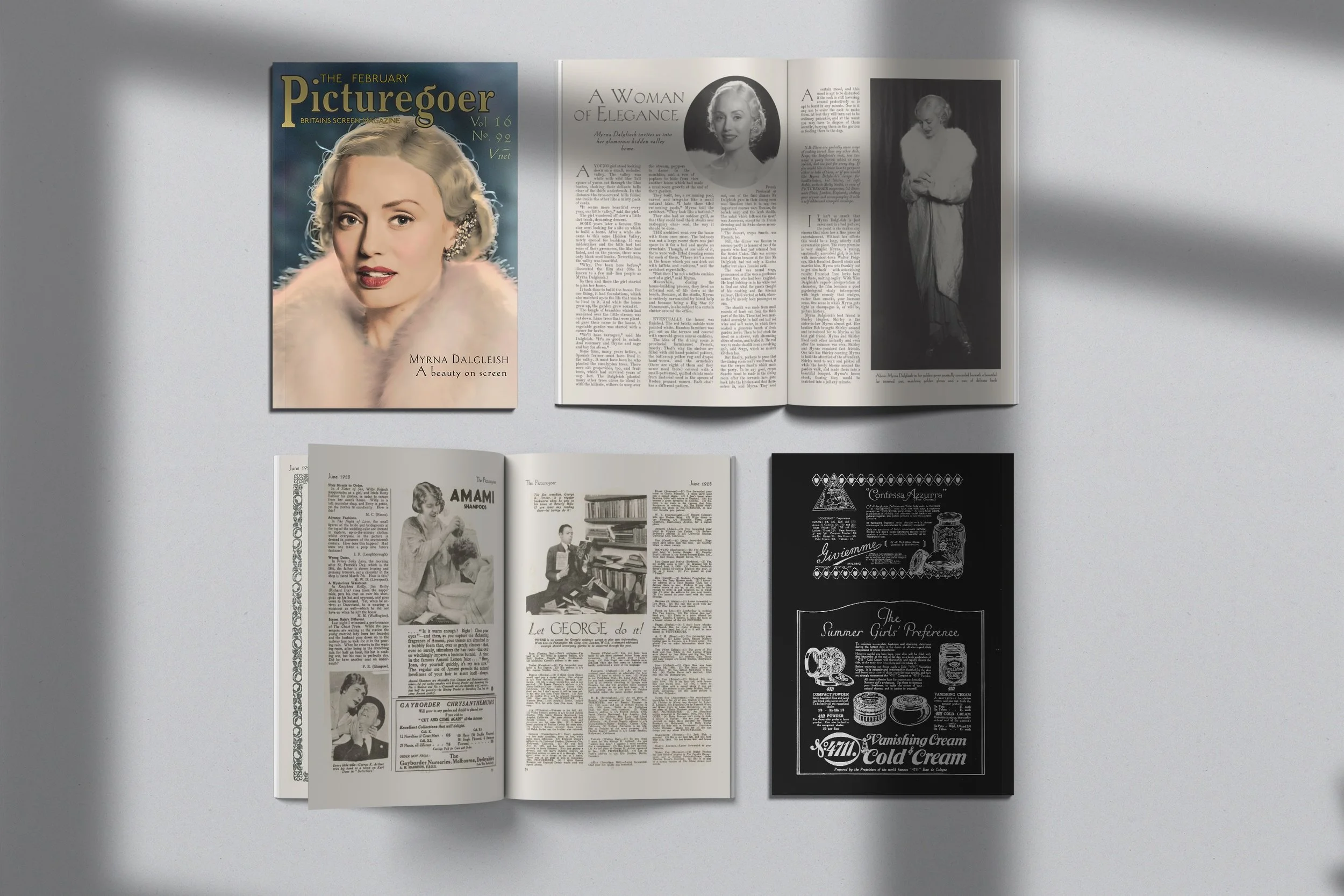
The magazine cover was based on ‘The Picturegoer’, a real and widely circulated film magazine of the period. We produced both the outer cover and an interior spread, supported by a dedicated photoshoot with the actors in costume and makeup.
Originally intended as a painted illustration, the cover direction changed late in the process when the director responded strongly to the photography. To retain period accuracy, I converted the image to black and white and hand-coloured it, referencing early photographic retouching techniques to achieve a soft, vintage finish appropriate to the late 1920s.
Cover and inside pages used alongside real pages from ‘The Picturegoer’.
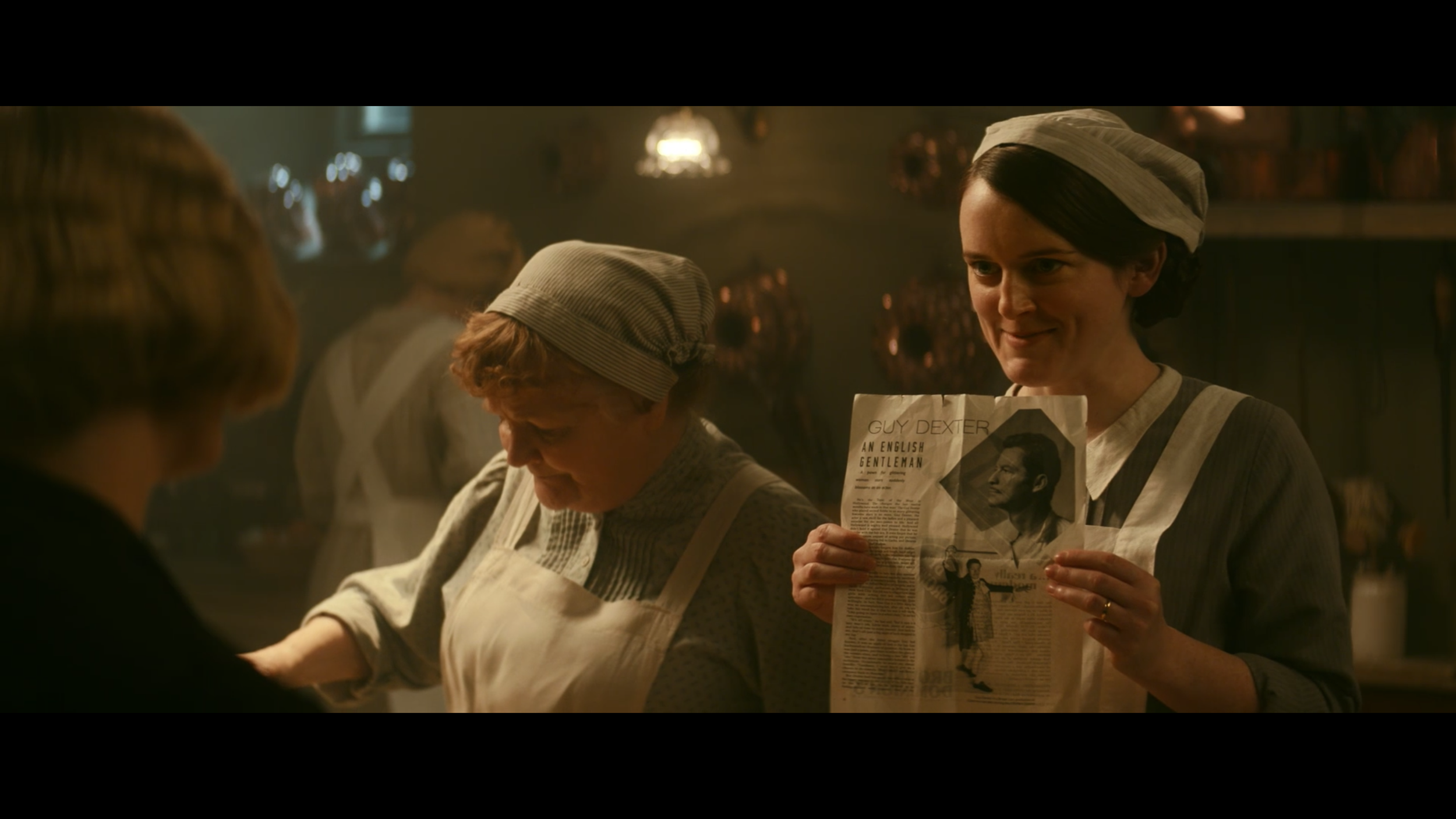
Anna and Daisy showing their excitement about the new visitors at Downton.
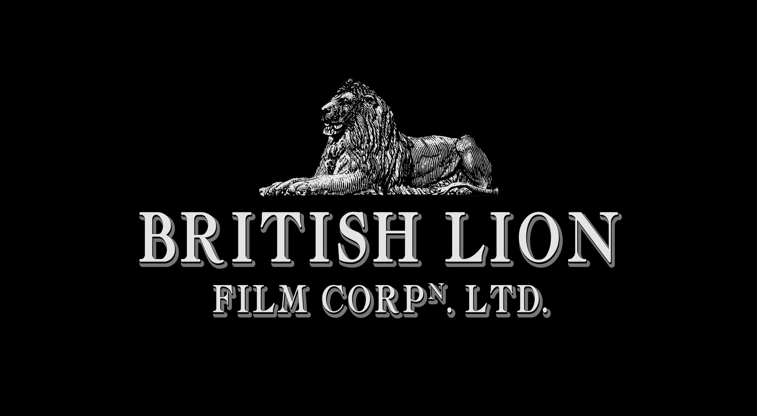
The finalised logo used in the film.
The logo was informed by research into film title cards from the 1920s to 1940s, balancing traditional heraldic influence with the emerging professionalism of the British film industry. I tested several font styles, including bold serif and script, to see which best conveyed the period while working alongside heraldic imagery of lions. Ultimately, the bold serif was chosen, as it felt more stately and distinctly British, in contrast to the glamorous, Hollywood-style script fonts common in the 1930s.
The logo needed to feel established, credible, and unobtrusive, capable of being applied consistently across props such as the film truck, business cards, and script pages, while supporting the narrative without drawing attention away from the action.
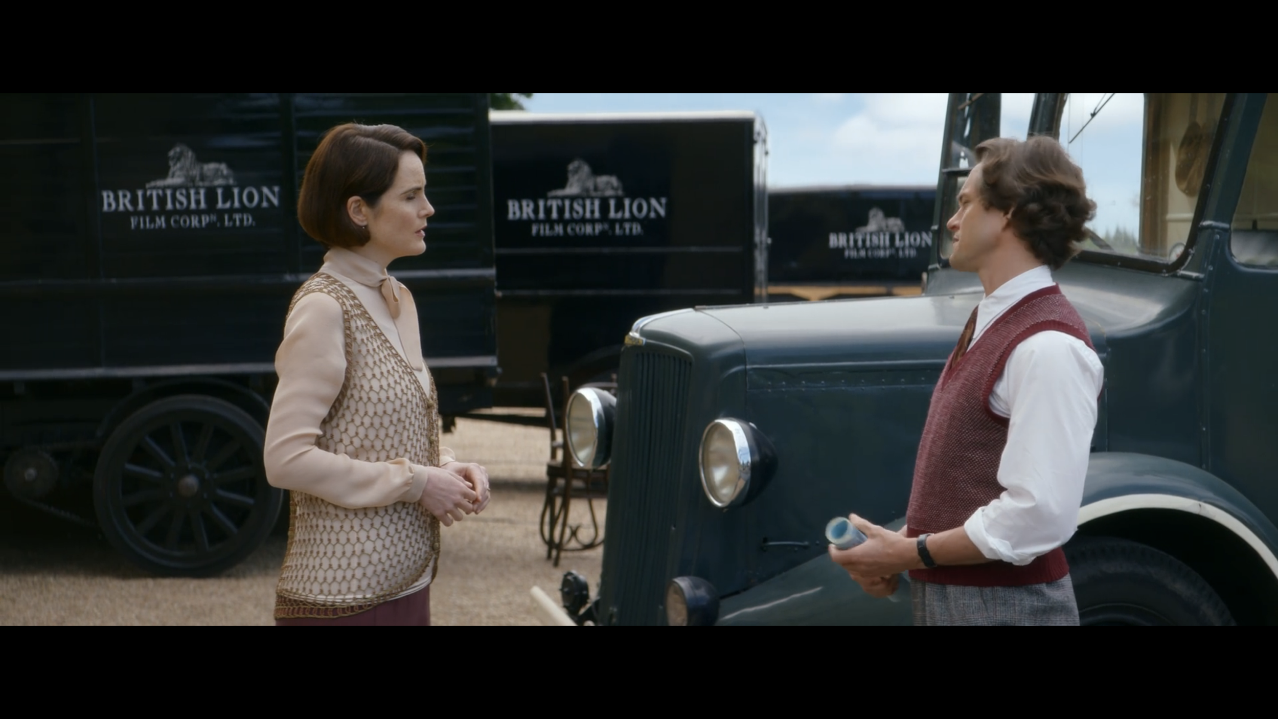
British Lion Film Corp
Studio identity
For Downton Abbey: A New Era (2022), I designed a film studio logo that could be applied consistently across multiple props. The British Lion Film Corp identity appears on the film truck, business cards and script pages, requiring it to function across scales and materials.
End card from ‘The Philadelphia Story’’.
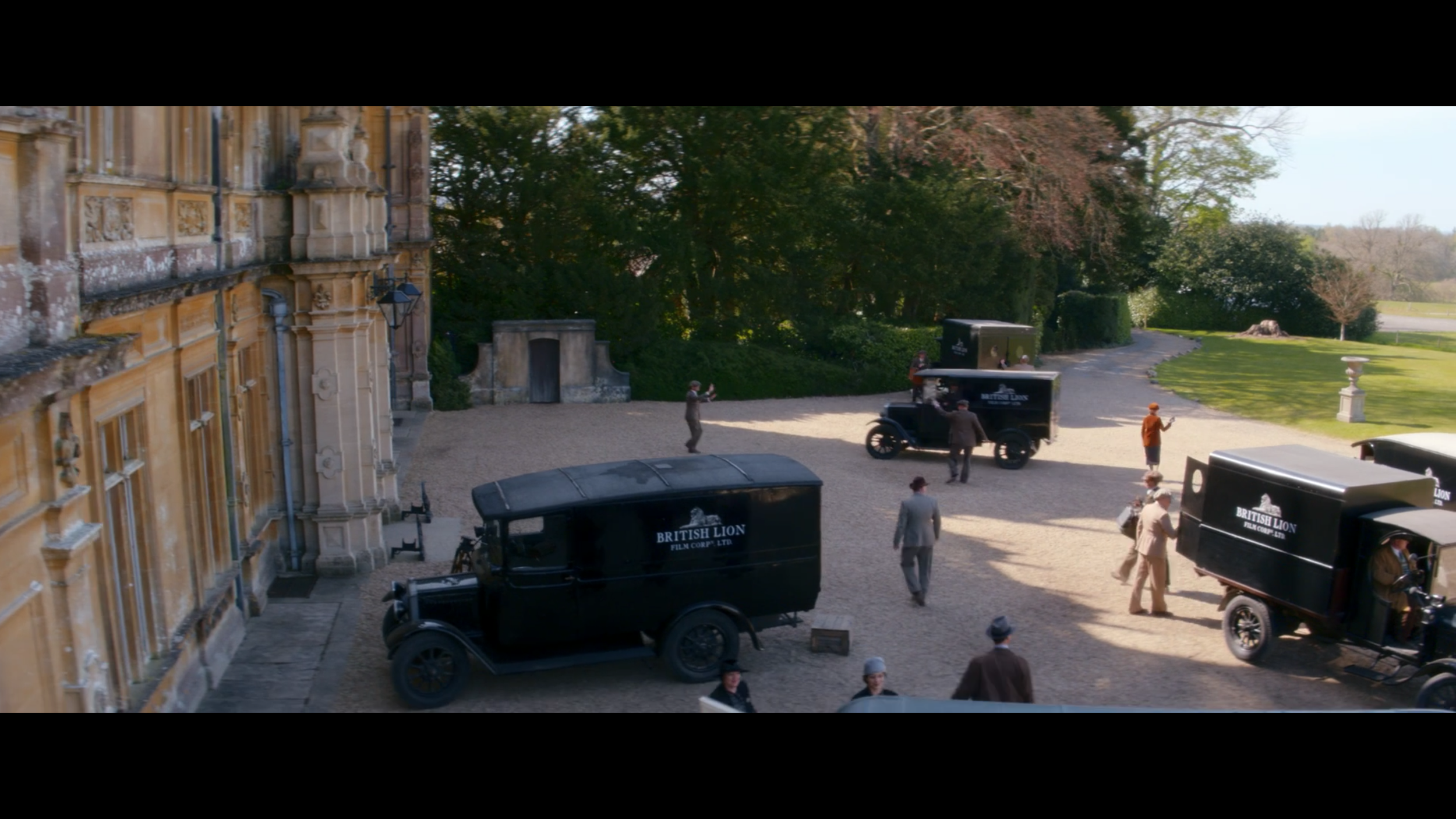
Black film trucks with the British Lion logo on the grounds at Downton.