


‘Half Bad - The Bastard Son & the Devil Himself’ opens with our lead character as a baby. To set up the background of the world a cartoon stork card is discovered with the just the words ‘kill it’ scribbled inside. I designed the card to be as sweet and wholesome as possible to contrast sharply with the message and illustrate that this is the baby being referred to.
The association between storks and birth was particularly strong in European folklore. In medieval Europe, it was widely believed that storks delivered babies. This belief may have been influenced by the migratory patterns of storks, which coincide with the time when many babies are born in Europe. Storks' return to Europe in the spring was often seen as a sign of fertility and the arrival of new life.

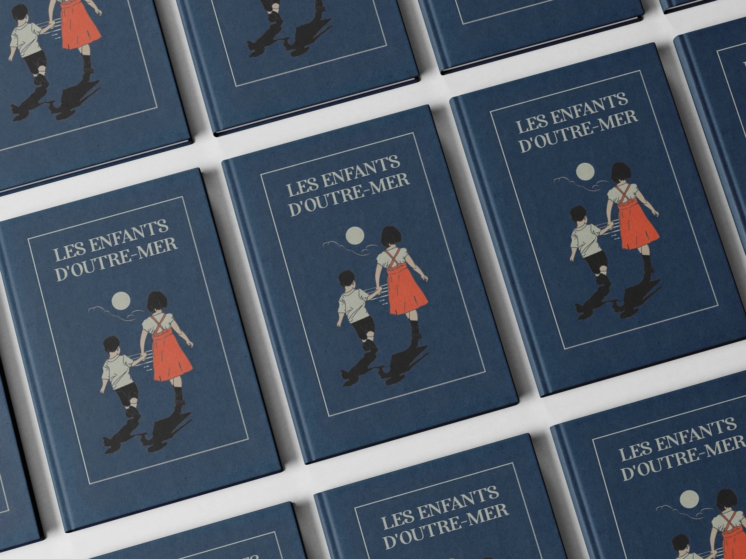
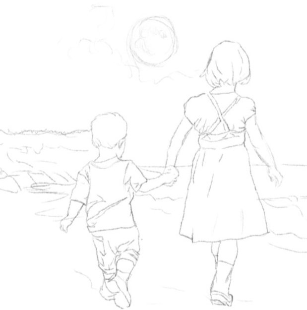
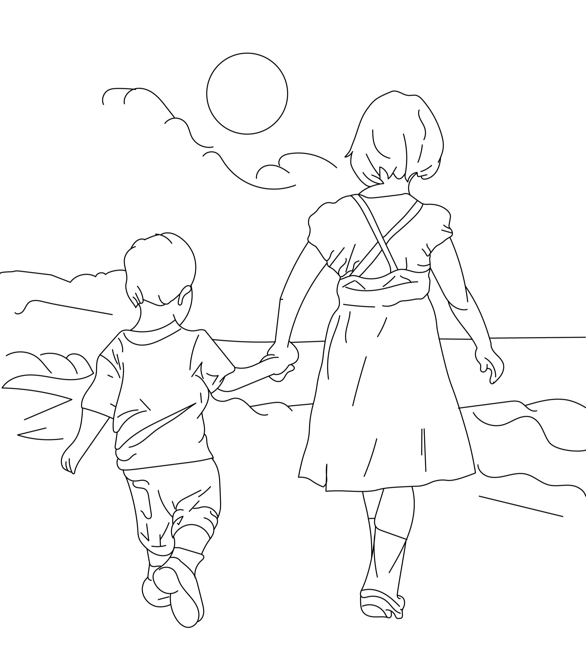
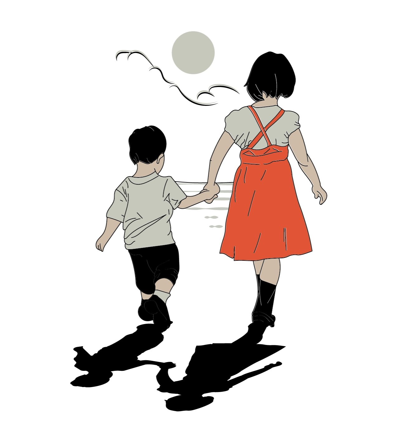
For the Netflix show ‘Half Bad - The Bastard Son & the Devil Himself’ a prized possession of Gabriel is his children’s book with various names inscribed inside the cover. We wanted to make the design resemble classic ladybird books. Ladybird book covers are iconic in their design, evoking a sense of nostalgia and charm. The classic Ladybird book covers often feature a simple yet captivating combination of bold colors, whimsical illustrations, and clean typography. The typography is clean and legible, ensuring that the titles and authors' names are easily recognizable. These design choices not only make Ladybird book covers aesthetically appealing but also convey a sense of elegance and timelessness, leaving a lasting impression on readers.

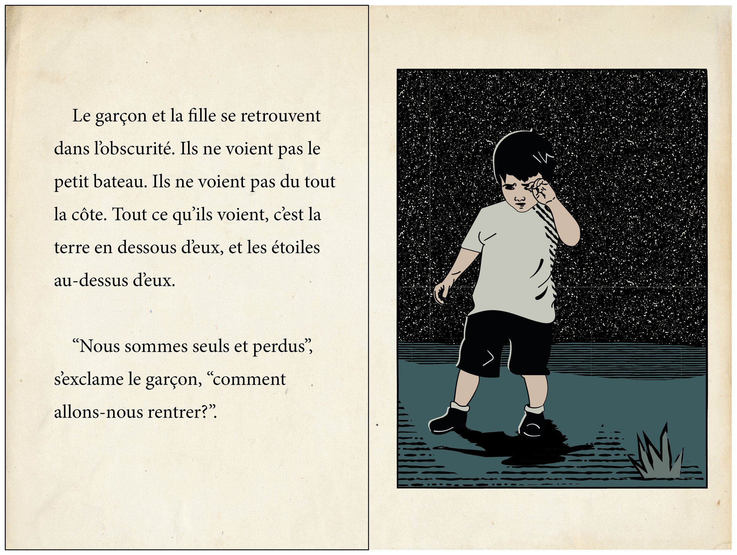
The boy and the girl found themselves standing in the dark. They could not see the little boat. They could not see the shore at all. All that they could see was the earth beneath them, and the stars above them.
“We are lost and alone” said the boy, “how ever will we find our way home?”
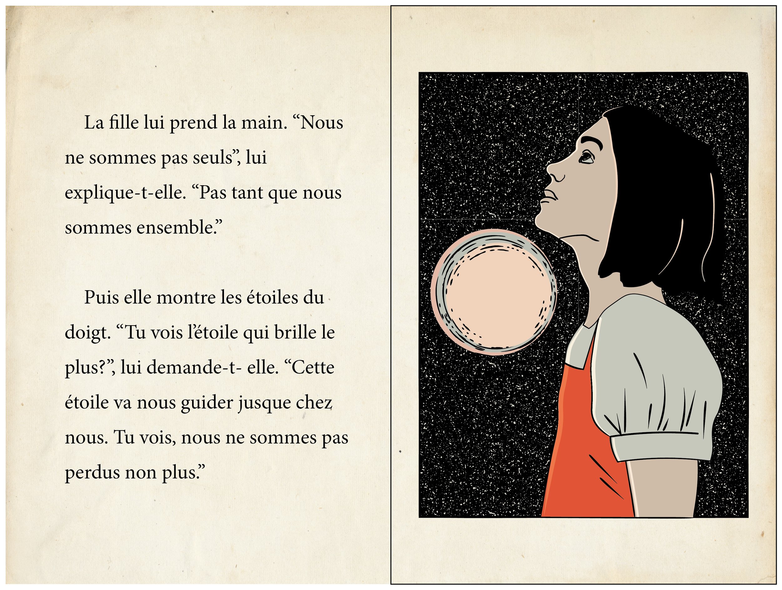
The girl took his hand. “We are not alone,” she said. “Not while we have each other.” Then she pointed at the stars. “Do you see the brightest star?” She asked him. “That is the Star that will guide us home. So you see; we are not lost, either”
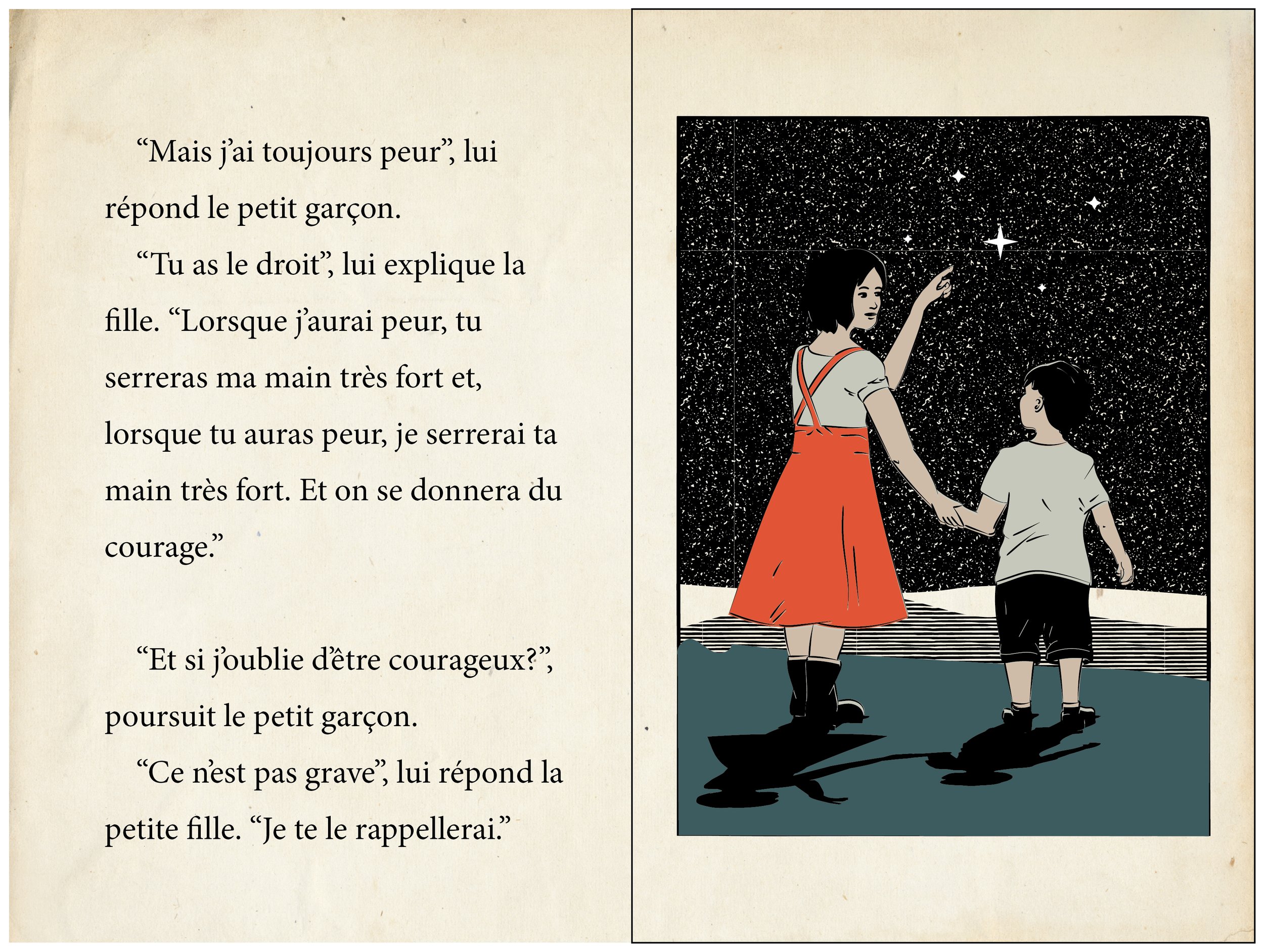
“But I still feel afraid” said the little boy.
“That’s Okay,” said the girl. “When I feel afraid you can squeeze my hand, and when you feel afraid I will squeeze your hand. And we will be brave together.”
“What if I forget that I am brave?” Said the little boy.
“It’s okay” the little girl said. “I will remind you.”
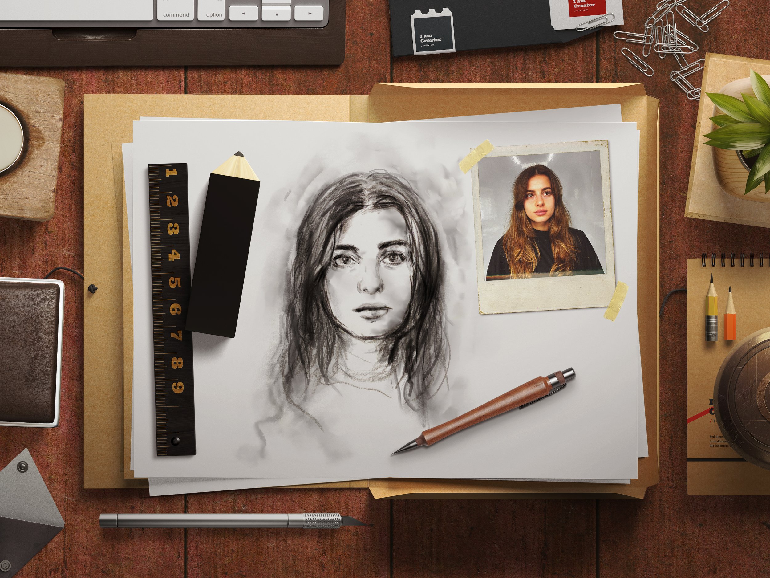
Another key prop for the Netflix show ‘Half Bad - The Bastard Son & the Devil Himself’ is a sketch of Annalise in charcoal. This sketch had to be produced in a way that could be reproduced easily as the sketch is burnt later in the show. Repeats are a common issue for TV/film as multiple takes often are required. I created a light version for this drawing that charcoal could be smudged over for close-ups.


These posters were based on real French safety posters. I had a lot of fun drawing various tongue-in-cheek situations for the Netflix production ‘Half Bad’ (2022). French poster design in the 1960s was characterized by vibrancy and innovative techniques that captivated audiences. Influenced by emerging art movements such as Pop Art and Op Art, these posters embraced bold colors, strong graphic elements, and experimental typography. The iconic imagery and avant-garde compositions reflected the social and cultural transformations of the era. Artists like Raymond Savignac and Bernard Villemot crafted memorable posters that captured the essence of the zeitgeist, seamlessly blending aesthetics and communication. French poster design in the 1960s pushed boundaries, creating visually striking pieces that remain influential in the world of graphic design today.


